By Stuart Gonsal
A website reflects the person or organization it represents. That gives it character. Web users look for uniqueness. They want to find an attractive, user-friendly site. Is one of your goals to stand out from the crowd? Then you have to build a navigation system that is like no other.Why? It is probably one of the first things users see during their visit.
Since most websites have some type of navigation system in place, designers have to push their creative limits. They have to explore different graphics programs, and force themselves to produce original creations that are attractive yet extremely functional and consistent.
Select a Trendy Layout Style
Navigation is, without a doubt, the most important element in web design.Users need a sense of orientation and guidance to find their way around a website. Smart designers know how to create a navigation system that is both attractive and efficient. They look for examples that have proven to be very successful. The hottest trends today include the following:
- Block navigation
- Visually appealing icons
- Experimental, but well-tested designs
- Responsive layouts
- Retina graphics
- Horizontal navigation
- Fixed header bars
- Large photo backgrounds
- CSS transparency
- Minimalistic landing pages
- Digital QR codes
- Detailed illustrations
- Mobile navigation toggle
- Full-screen typography
The list is quite extensive. If you are looking for examples and ideas, explore the following 3 inspirational navigation designs.
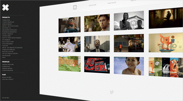
1. Toybox
Do you want to limit confusion and distractions? Create a navigation design that is there when the user first arrives, but graciously disappears whenever a visitor wants to concentrate on a specific task? The navigation system of the Toybox, which is the home of a team of highly trained design artists,is a perfect example. The homepage is easily accessible, but also offers prominence to the website’s critical features. The swivel effect directs a visitor’s attention to the navigation bar whenever they are using it. Once the navigation bar is hidden, the projects are not competing with each other. It allows the user to focus better on what they want to accomplish.

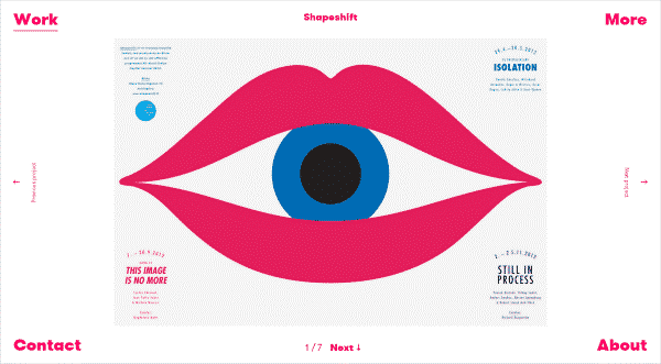
2. Tsto
Are you looking for a simple yet unorthodox design approach? Review the digital agency Tsto’s masterpiece. Navigation elements are located in the corners of the page, neatly framing the eye-catching image in the centre. The hot-pink colour certainly attracts a lot of attention, but not in an overbearing way. The hierarchy is comprehensible, keeping in step with current navigation design trends. The “contact” and “about” tabs are at the bottom of the page.
Another great feature is that users can see the company’s projects without leaving the page. Clicking through the images gives potential customers a chance to view the company’s achievements. All they have to do is click on the “previous project” and “next project” icon on each side of the page.

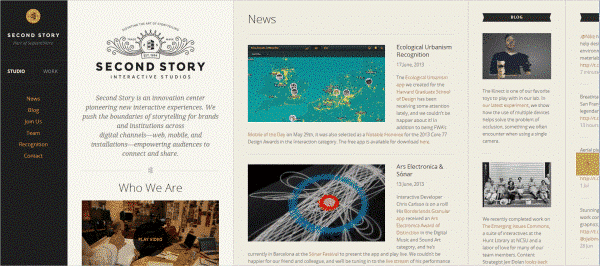
3. Second Story
The Second Story’s website resembles a magazine app on a tablet. It is a pioneering design in that it does not give you the feel of a typical page. Instead of moving up and down,you scroll sideways (horizontally). Readers will find the columns fascinating.They have to scroll vertically to access the content. A touch of tradition remains as the navigation icons are anchored at the left side of the page. That makes it easy for users to get to that section they are most interested in. It is almost like watching a slide-show.

2014 Predictions under the Microscope
The world of web design changes every year. New technology and the evolving preferences of consumers and Internet users push the industry into exciting but challenging directions. Web designers have to be constantly on their toes, because what is hot today may be outdated tomorrow. Many speculate about upcoming developments. What has the coming year in store for website navigation system experts?Let’s speculate!
1. Code Free Designs
Finding easier ways to generate and build websites and navigation designs has always been a main goal of eager web designers. What happens if they can free themselves of tedious coding requirements? Webydo has produced an online design studio where there is no need for coding. You can literally transform the way the web was created. Webydo fans will, undoubtedly, stay the course in 2014.
2. Improved Website Responsiveness
This trend was sizzling hot in 2013, and is not cooling off yet. With the amount of people using mobile phones, navigation systems have to cater to a variety of smaller screen sizes and resolutions. Creative web designers will work hard to find innovative ways to tackle responsiveness in website design. With the continuous developments in website browsing technology, site responsiveness will remain a much-talked about issue around the water cooler.
3. Retina Display Support
Aside from being one of today’s key marketing buzzwords, a “retina display” is basically one of Apple’s high-end liquid crystal display screens with a lot more pixels than ordinary devices. The pixel density is so extreme that the human eye cannot identify pixilation typical for a normal viewing distance. Retina optimized websites rank high on most web designers’ priority list. This trend will undoubtedly grow every time whenever more Apple products are launched with retina displays, aside from the iPad, iPad Air, iPhone, iPod Touch, iPad Mini, and MacBook Pro.
4. Flat Web Designs
Simplicity seems to be on everyone’s mind when experimenting with navigation designs. The basics of this idea are straightforward. There are no 3D elements or shadows. The designs use a full 2D screen instead. This trend is also expanding because of the Windows 8 metro screen, which is their default tile interface.The design is characterized by strong lines, saturated colours, no shadows, minimalism, and the creative use of typography or printed matter.
5. Simplistic Design
Flashing icons are an eyesore. These digital images are annoying and ineffective. People do not want anything gaudy or complicated when exploring the Internet. They want things to be simple.Websites need to be fast, but easy to read and understand. Equipment, such as mobile devices have to be compatible. This can be accomplished by keeping websites and navigation designs plain, like it was years ago. In other words, the old is new again.
About the author
 Stuart Gonsal is the co-founder and managing director of Wolf Interactive, a boutique web design, development and digital strategy agency in Melbourne. Stuart believes in collaboration and that people and ideas are at the heart of every successful project. Lava is specialised in building Magento ecommerce solutions. Follow Stuart on Linkedin, Google+ or visit at http://wolfinteractive.co