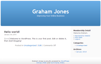
WordPress is one of the most popular pieces of software around. Indeed, on WordPress.com there are over 11m blogs – and as for the number of websites that are built using WordPress.org, well it’s anyone’s guess. Wikipedia suggests that around two in every 100 sites is constructed using WordPress. But there is a problem – it’s built by engineers.
Engineers like things to be logical, so it is logical to put the important stuff top left of the page where most people start reading a web site. So, that means, logically, the menu items and the other “widgets” are put on the right hand side of the page. All nice and logical but all nice and wrong.
Template designers have followed suit. Vast numbers of templates for WordPress – and other content management systems such as Blogger or Joomla – now have menus on the right hand side of the page, together with other navigation items, listings and so on. There is a tendency to put the content on the left and the menus on the right.
Eye-tracking studies show that people start looking at a website at the top left of the page, go across, then back and down, then across, then back and down, rather like the letter F. This has led graphic designers to adopt an alternative approach to engineers – putting the navigation top left, where most people start looking at a web page.
However, new research suggests that the graphic designers are right and the WordPress engineers are wrong. A massive study involving over 60,000 participants has just been published in the Quarterly Journal of Experimental Psychology. The study looked at memory and spatial processing – how we analyse the shape of the world around us. What the researchers found was astonishing – but with such a large number of participants has high statistical value. We remember things much more easily if they are presented to us on the left. If items appear to the right of us, we find it much harder to remember them.
So, on your website, do you want people to remember your latest piece of content – presented on the left in “standard” WordPress? Or do you want them to remember that your site covers half a dozen topics on your theme, that it has a newsletter and that it has a search function – all presented on the right in “standard” WordPress? Alternatively, do you want people to remember what your site is about, with some regular keyword menu items that always appear on the top left, rather like a graphic designer would produce?
This new research from the University of Edinburgh would suggest that you are going to gain more if your navigation and other important items are presented top left, rather than top right. If you want people to remember what your site is about and the kind of things you offer, this new study implies that the best place for those items is on the left of your web pages – not the right.
If you follow the WordPress basic template layout – which is widely becoming a standard in many template systems – you may well be producing a logically organised site, but you may be making it more difficult for people to remember what you do. And that could make all the difference to the eventual success of your website.


