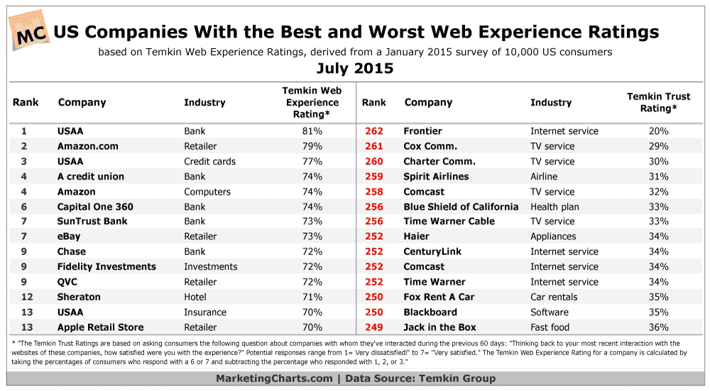
A study of 10,000 American web users has discovered that USAA.com is the best website they use. USAA is a financial institution for military personnel and their families. It provides banking, insurance and credit cards – but you have to have a military connection. However, according to the research from Temkin Group, USAA is deemed the best website in terms of our experience. It appears in the rankings as Number 1 for banking, Number 3 for credit cards and Number 13 for insurance – that’s three Top 20 positions out of 262 possibles. Not bad. So we have to ask “why?”
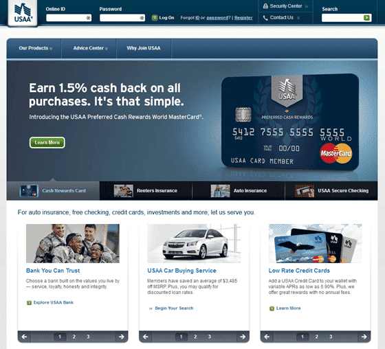
Take a look at their website and it seems much like any other website. It is aesthetically OK, it loads quickly and it has obvious ways to log in to your account. So there must be something else, more subtle, that is making the experience of using this website better than Amazon, for instance, which also features in the Top 10 listing.
There are some psychological factors that are working well here and making the visitors to this site enjoy their experience.
Firstly, the site is not asking you to make too many decisions. Indeed, there are only three menu options at the top. There are also three blocks of possible options below the main image, and each of those has only three possibilities. Do you think they have chosen the number three because they like it? No; this is to do with the psychology of decision making. When we have lots of options and choices, we find it hard to make a selection. Studies show that when we are given three choices we find it much easier to make a decision. Also, research shows that when we are faced with a wide choice we are less satisfied with what we eventually decide upon than if we have fewer selections. USAA offers many more things than the three options they present. Furthermore, within each option they offer even more, but only suggest three. Each time you select something you get “drilled down” into making a further choice. Rather than giving you lots of options all in one go, USAA takes you through your potential choices, three at a time. Psychologically that is much more appealing. We find it easier and we like what we have chosen much more than if we had to select from 25 options all in one go.
Secondly, you can see all the potential choices you need to make all in a single screen. Compare this with the troubled bank Barclays. Their home page scrolls down and down and down and offers you 23 different things to choose from. This works against the psychology of convenience (something I talk about in my book Click.ology). Psychological convenience is a basic survival instinct – we are driven to do things with the least amount of effort, so our body saves energy for use in a potential crisis. When we have to scroll back and forth and are forced to make complex choices we find that tough. The USAA site avoids that issue and appeals to people because it is obviously quick and easy to use, appealing to psychological instincts.
Finally, the USAA site has a clear and obvious “Advice Centre” which provides financial advice and is packed with hundreds of articles and information. This helps establish trust and confidence in a brand when the information they provide is not sales oriented, but independent material that is focused on the needs of the visitor. When a website is focused more on the world of the visitor than the world of the company, people rate it more highly as they enjoy the experience more. Many other banks appear to offer only sales-related information, making visitors less likely to enjoy the experience.
So what does USAA.com tell us? It shows that limiting choice on a website improves the experience. It suggests that scrolling sites with lots of options are an annoyance. And it demonstrates that having lots of independent sector knowledge that is not sales-related is what people like.
If you want your website to learn from the USAA.com findings, do the following:
- Make your website appear in a single screen without forcing people to scroll
- Limit the number of choices you provide
- Ensure your content is focused on the visitor and not on selling your wares


